
This article is a sponsored by Penpot
Since Brad Frost popularized the use of design systems in digital design way back in 2013, they’ve become an invaluable resource for organizations — and even individuals — that want to craft reusable design patterns that look and feel consistent.
But Brad didn’t just popularize design systems; he also gave us a framework for structuring them, and while we don’t have to follow that framework exactly (most people adapt it to their needs), a particularly important part of most design systems is the variants, which are variations of components. Component variants allow for the design of components that are the same as other components, but different, so that they’re understood by users immediately, yet provide clarity for a unique context.
This makes component variants just as important as the components themselves. They ensure that we aren’t creating too many components that have to be individually managed, even if they’re only mildly different from other components, and since component variants are grouped together, they also ensure organization and visual consistency.
And now we can use them in Penpot, the web-based, open-source design tool where design is expressed as code. In this article, you’ll learn about variants, their place in design systems, and how to use them effectively in Penpot.
Step 1: Get Your Design Tokens In Order
For the most part, what separates one variant from another is the design tokens that it uses. But what is a design token exactly?
Imagine a brand color, let’s say a color value equal to hsl(270 100 42) in CSS. We save it as a “design token” called color.brand.default so that we can reuse it more easily without having to remember the more cumbersome hsl(270 100 42).
From there, we might also create a second design token called background.button.primary.default and set it to color.brand.default, thereby making them equal to the same color, but with different names to establish semantic separation between the two. This referencing the value of one token from another token is often called an “alias”.
This setup gives us the flexibility to change the value of the color document-wide, change the color used in the component (maybe by switching to a different token alias), or create a variant of the component that uses a different color. Ultimately, the goal is to be able to make changes in many places at once rather than one-by-one, mostly by editing the design token values rather than the design itself, at specific scopes rather than limiting ourselves to all-or-nothing changes. This also enables us to scale our design system without constraints.
With that in mind, here’s a rough idea of just a few color-related design tokens for a primary button with hover and disabled states:
| Token name | Token value |
|---|---|
color.brand.default |
hsl(270 100 42) |
color.brand.lighter |
hsl(270 100 52) |
color.brand.lightest |
hsl(270 100 95) |
color.brand.muted |
hsl(270 5 50) |
background.button.primary.default |
{color.brand.default} |
background.button.primary.hover |
{color.brand.lighter} |
background.button.primary.disabled |
{color.brand.muted} |
text.button.primary.default |
{color.brand.lightest} |
text.button.primary.hover |
{color.brand.lightest} |
text.button.primary.disabled |
{color.brand.lightest} |
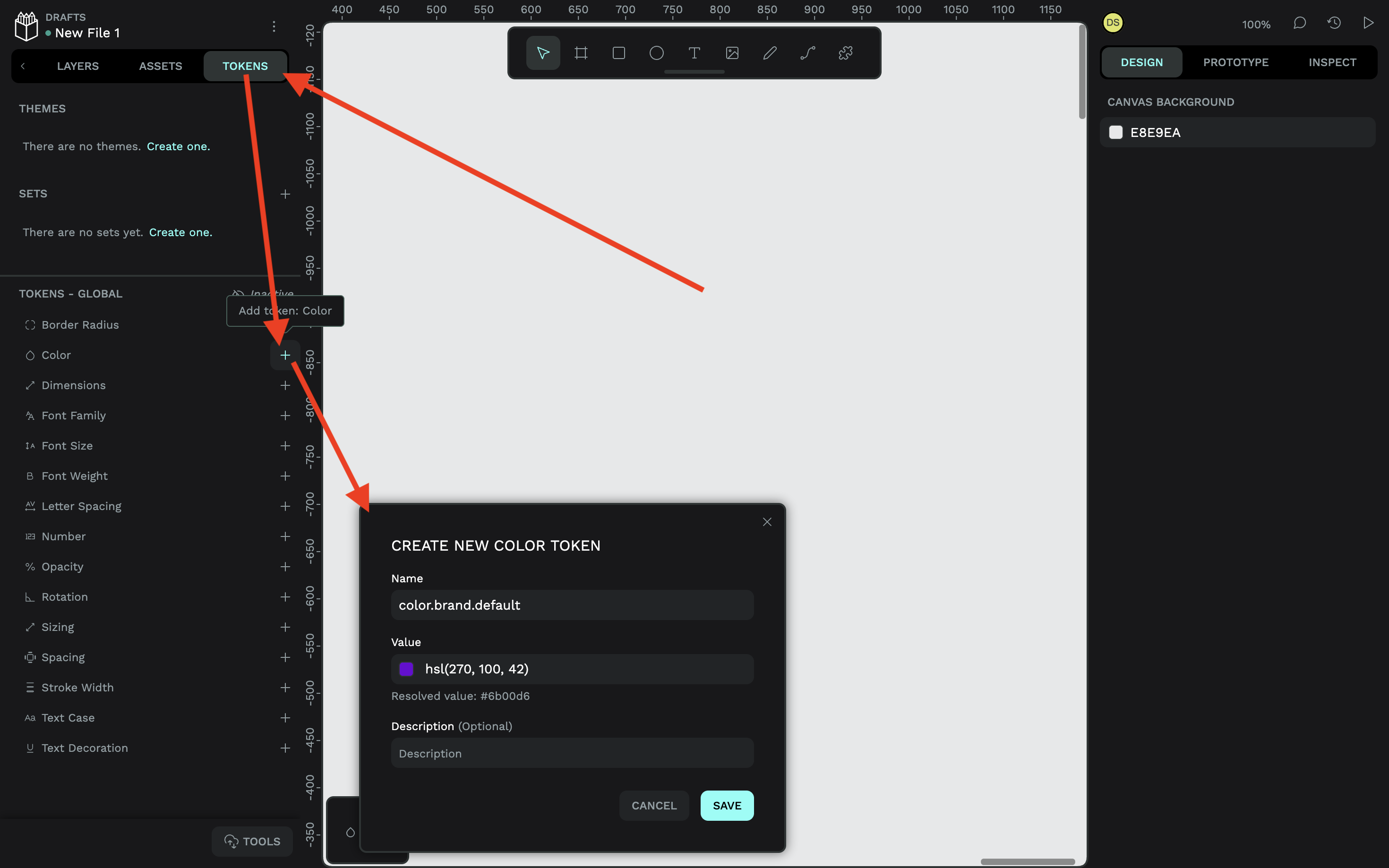
To create a color token in Penpot, switch to the “Tokens” tab in the left panel, click on the plus (+) icon next to “Color”, then specify the name, value, and optional description.
For example:
- Name:
color.brand.default, - Value:
hsl(270 100 42)(there’s a color picker if you need it).
It’s pretty much the same process for other types of design tokens.
Don’t worry, I’m not going to walk you through every design token, but I will show you how to create a design token alias. Simply repeat the steps above, but for the value, notice how I’ve just referenced another color token (make sure to include the curly braces):
- Name:
background.button.primary.default, - Value:
{color.brand.default}
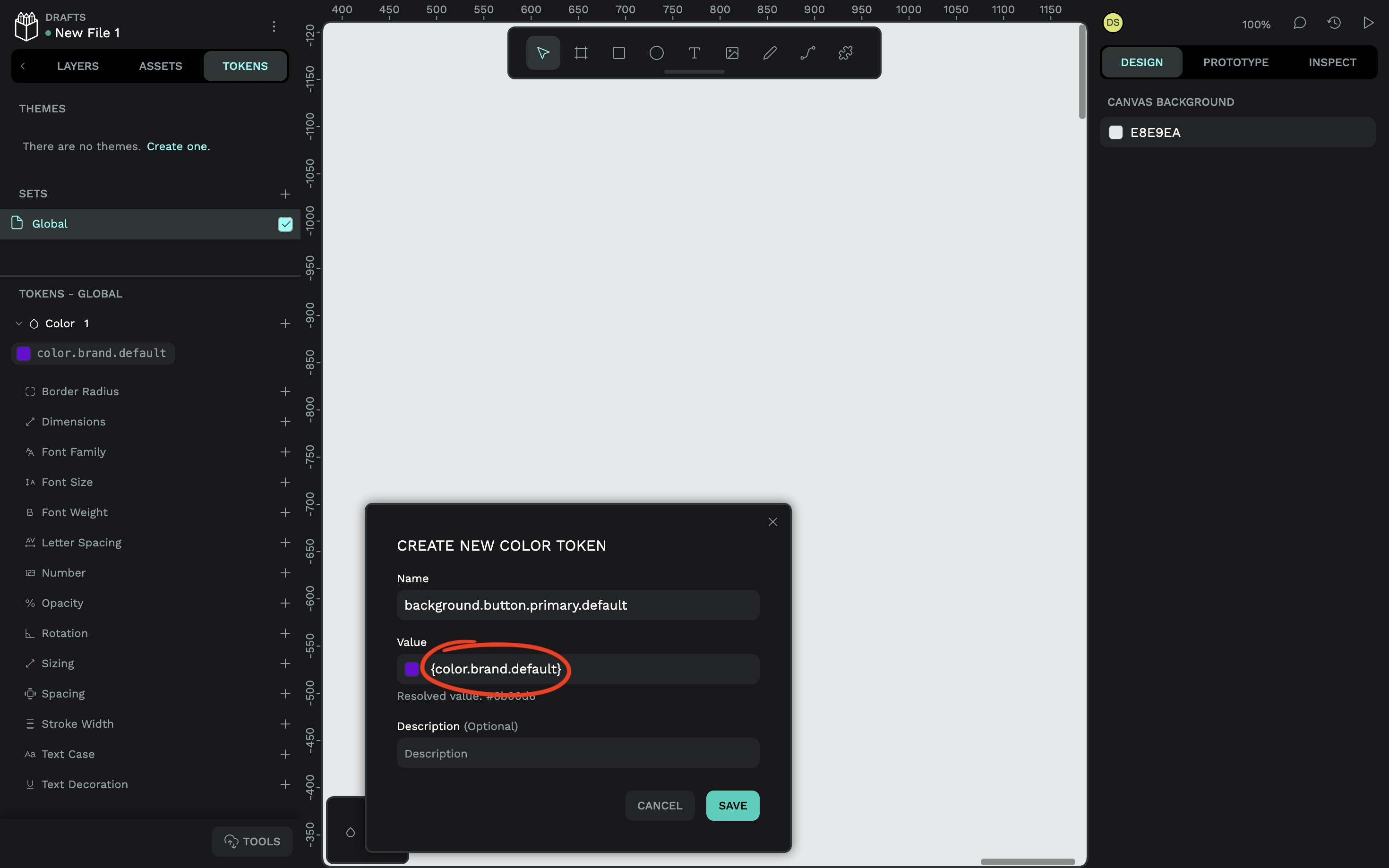
Now, if the value of the color changes, so will the background of the buttons. But also, if we want to decouple the color from the buttons, all we need to do is reference a different color token or value. Mikołaj Dobrucki goes into a lot more detail in another Smashing article, but it’s worth noting here that Penpot design tokens are platform-agnostic. They follow the standardized W3C DTCG format, which means that they’re compatible with other tools and easily export to all platforms, including web, iOS, and Android.
In the next couple of steps, we’ll create a button component and its variants while plugging different design tokens into different variants. You’ll see why doing this is so useful and how using design tokens in variants benefits design systems overall.
Step 2: Create The Component
You’ll need to create what’s called a “main” component, which is the one that you’ll update as needed going forward. Other components — the ones that you’ll actually insert into your designs — will be copies (or “instances”) of the main component, which is sort of the point, right? Update once, and the changes reflect everywhere.
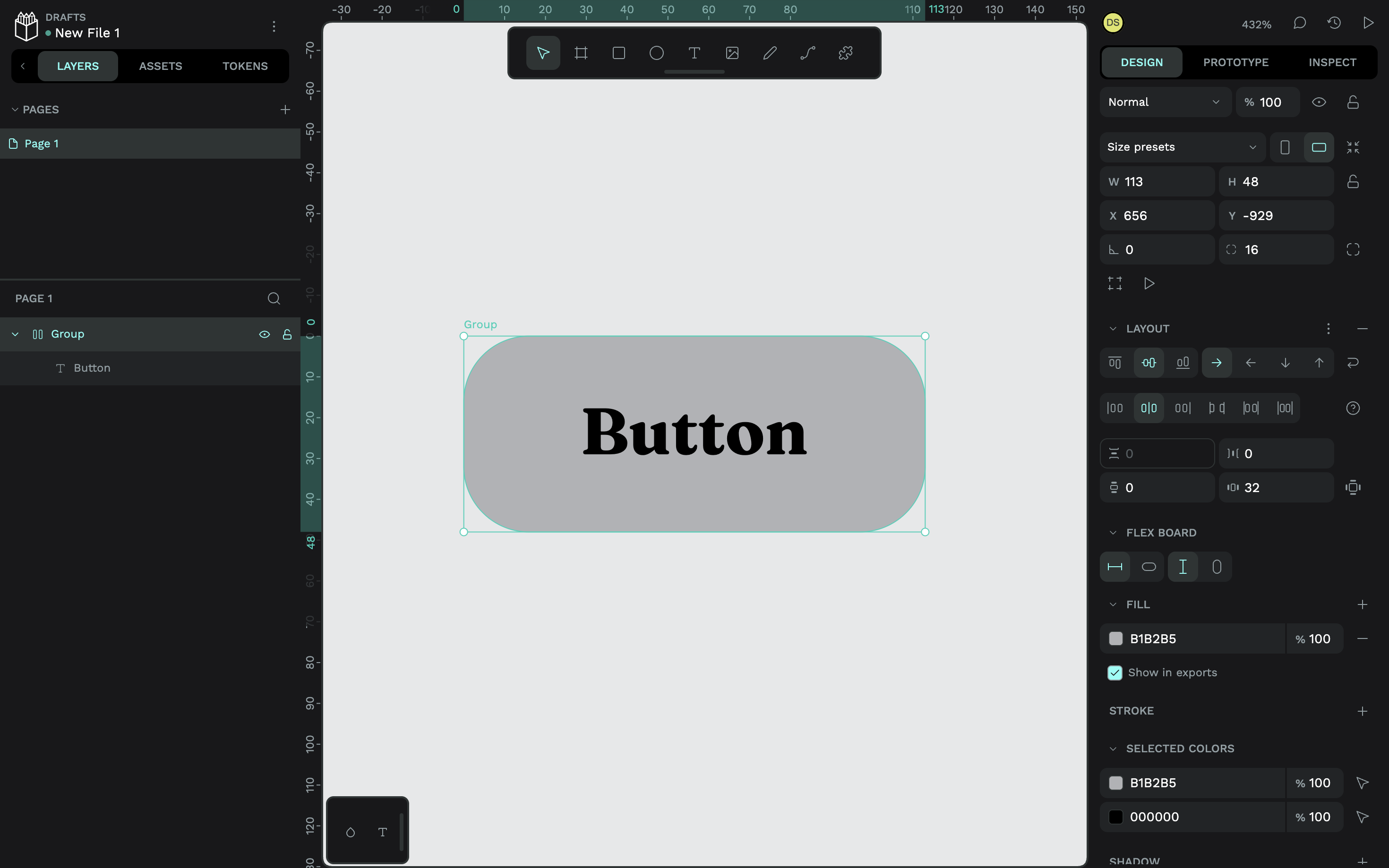
Here’s one I made earlier, minus the colors:
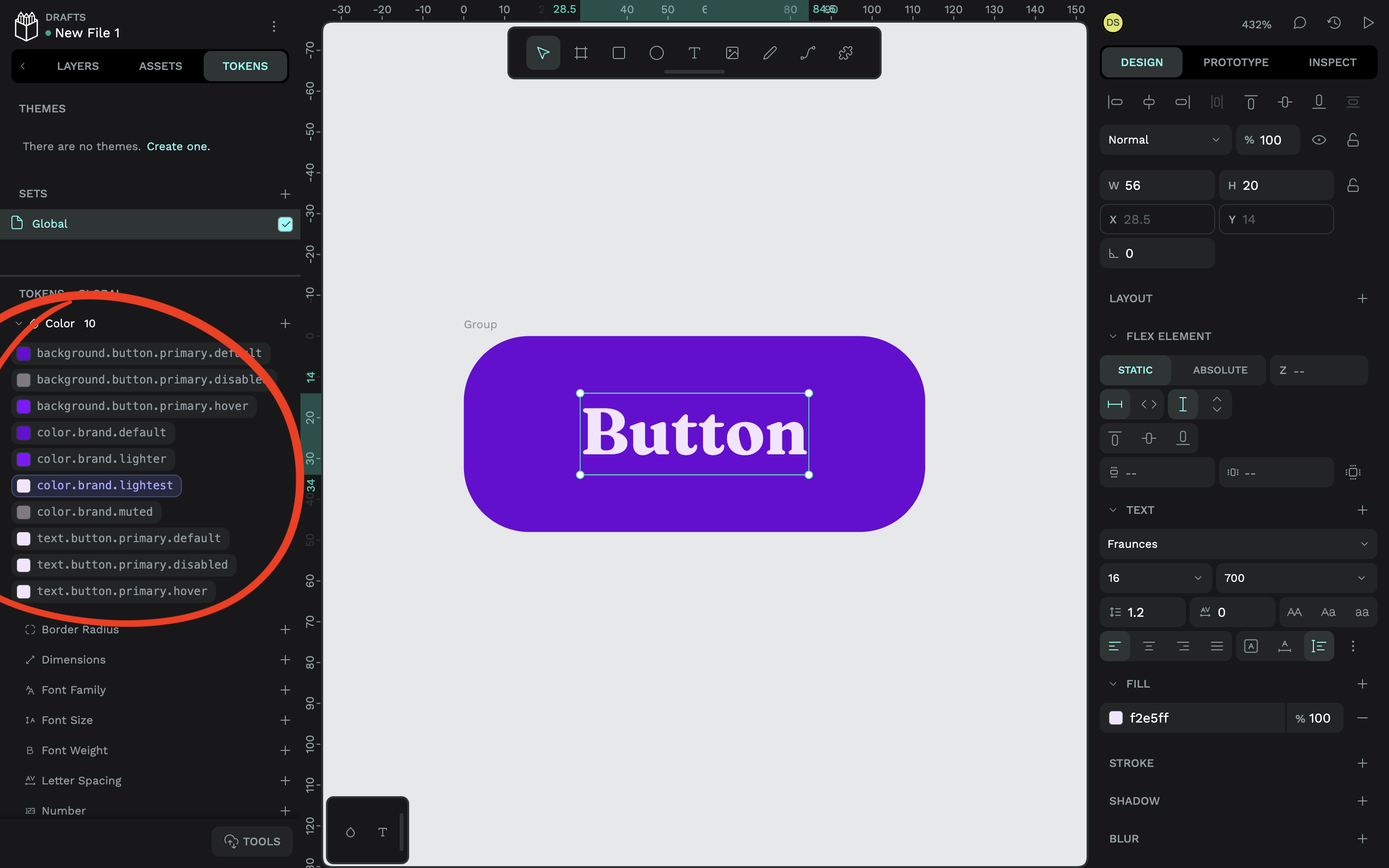
To apply a design token, make sure that you’re on the “Tokens” tab and have the relevant layer selected, then select the design token that you want to apply to it:
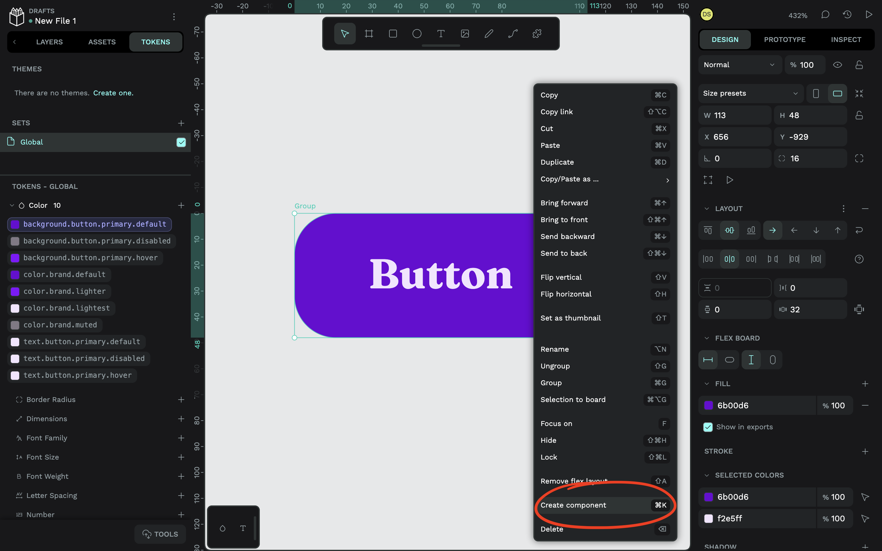
It doesn’t matter which variant you create first, but you’ll probably want to go with the default one as a starting point, as I’ve done. Either way, to turn this button into a main component, select the button object via the canvas (or “Layers” tab), right-click on it, then choose the “Create component” option from the context menu (or just press Ctrl / ⌘ + K after selecting it).
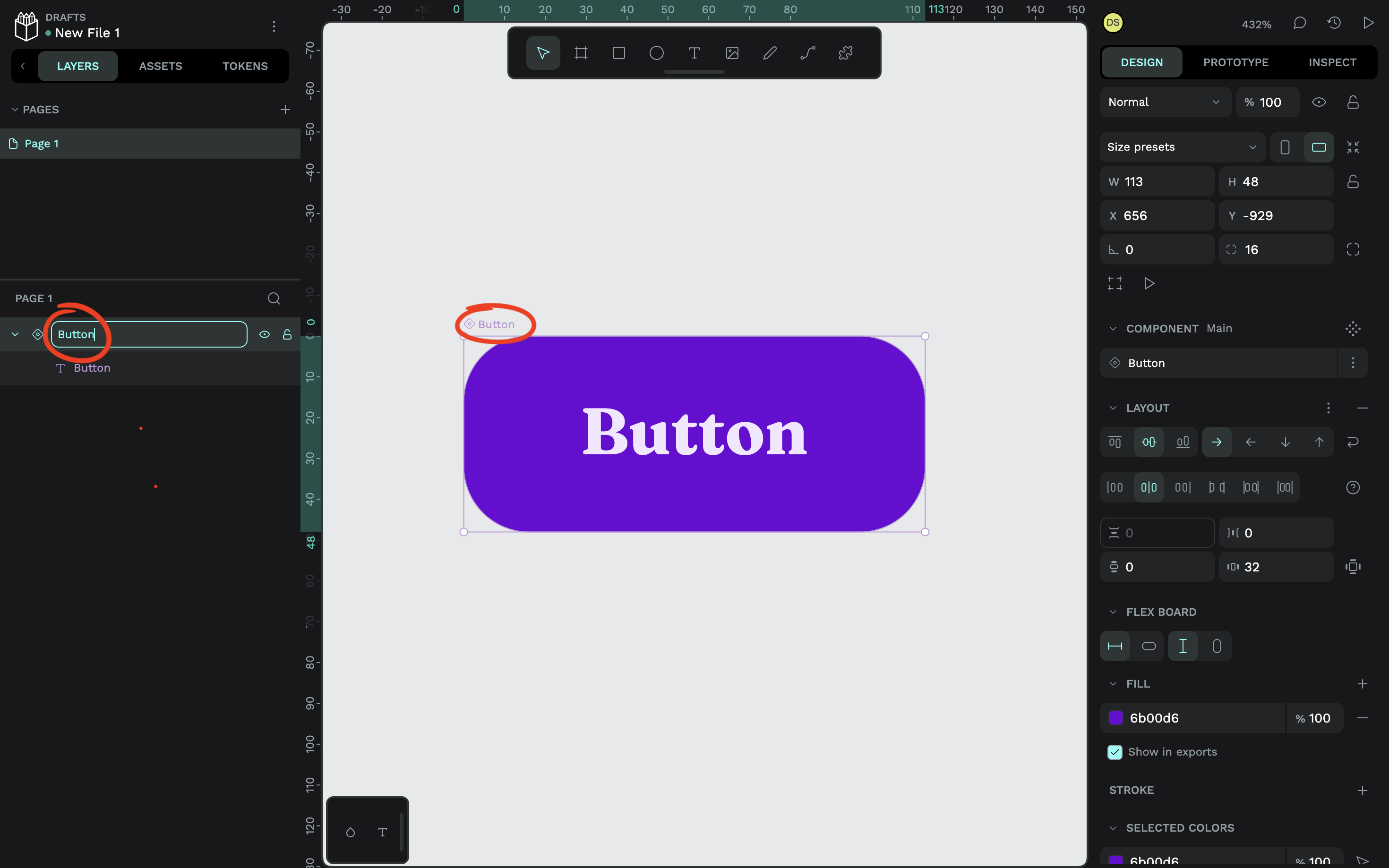
Remember to name the component as well. You can do that by double-clicking on the name (also via the canvas or “Layers” tab).
Step 3: Create The Component Variants
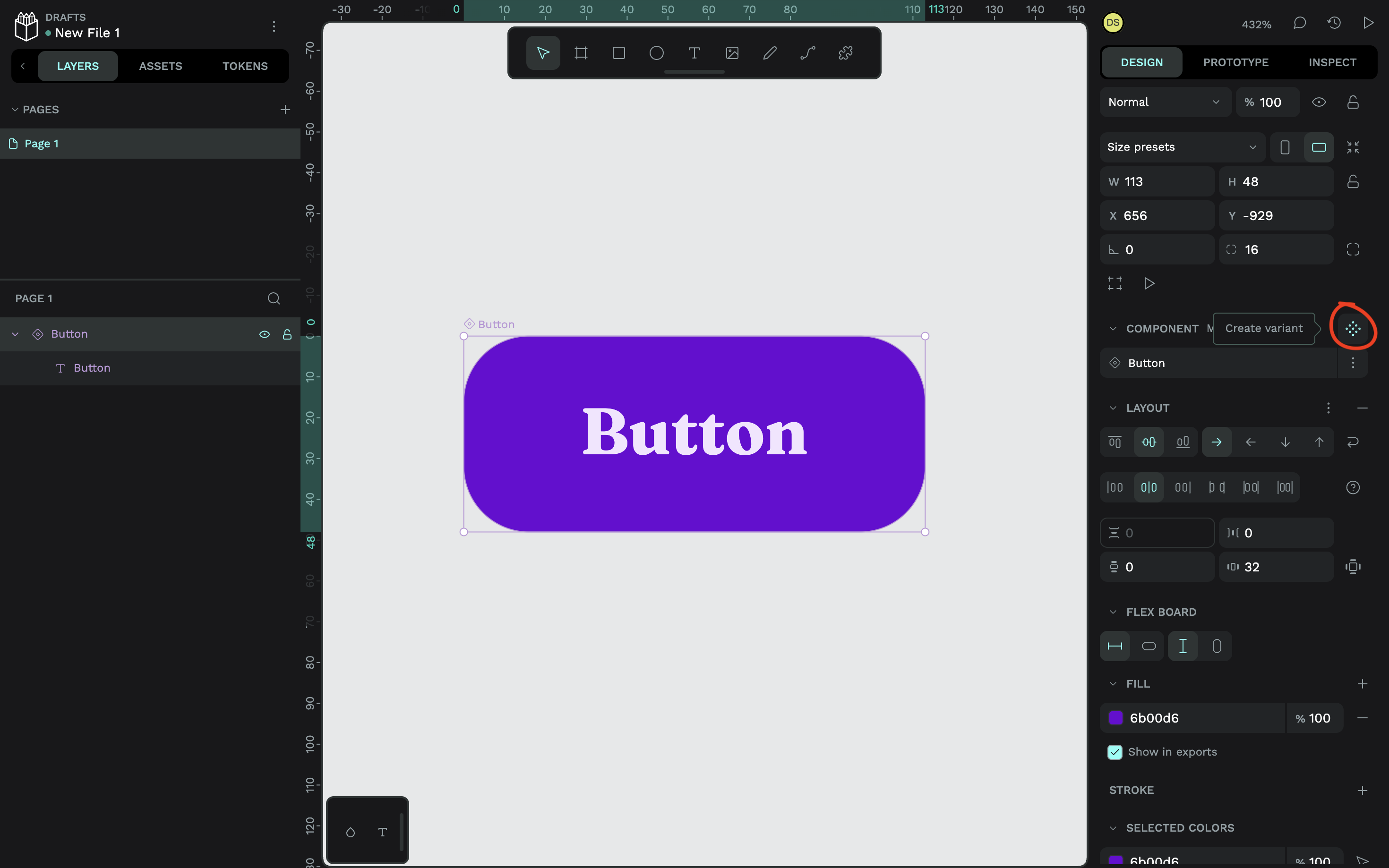
To create a variant, select the main component and either hit the Ctrl / ⌘ + K keyboard shortcut, or click on the icon that reveals the “Create variant” tooltip (located in the “Design” tab in the right panel).
Next, while the variant is still selected, make the necessary design changes via the “Design” tab. Or, if you want to swap design tokens out for other design tokens, you can do that in the same way that you applied them to begin with, via the “Tokens” tab. Rinse and repeat until you have all of your variants on the canvas designed:
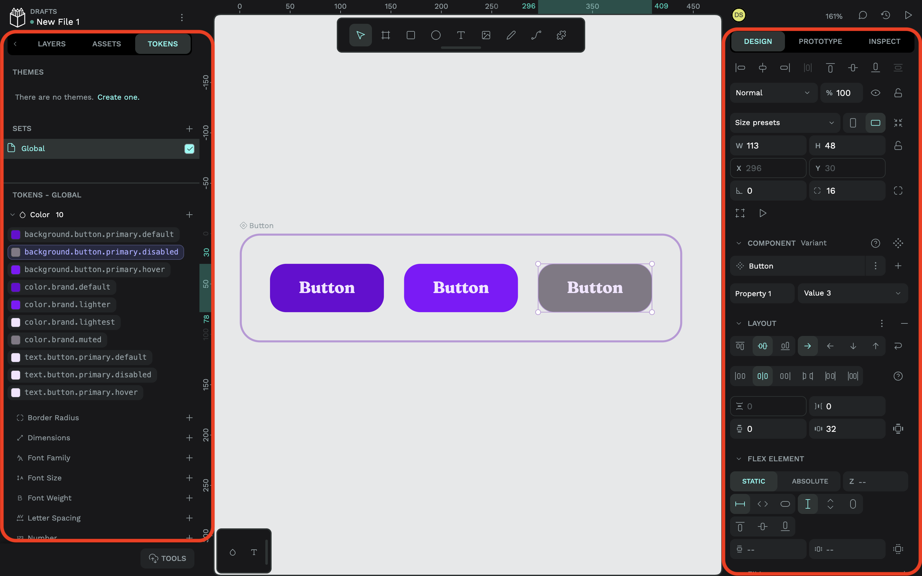
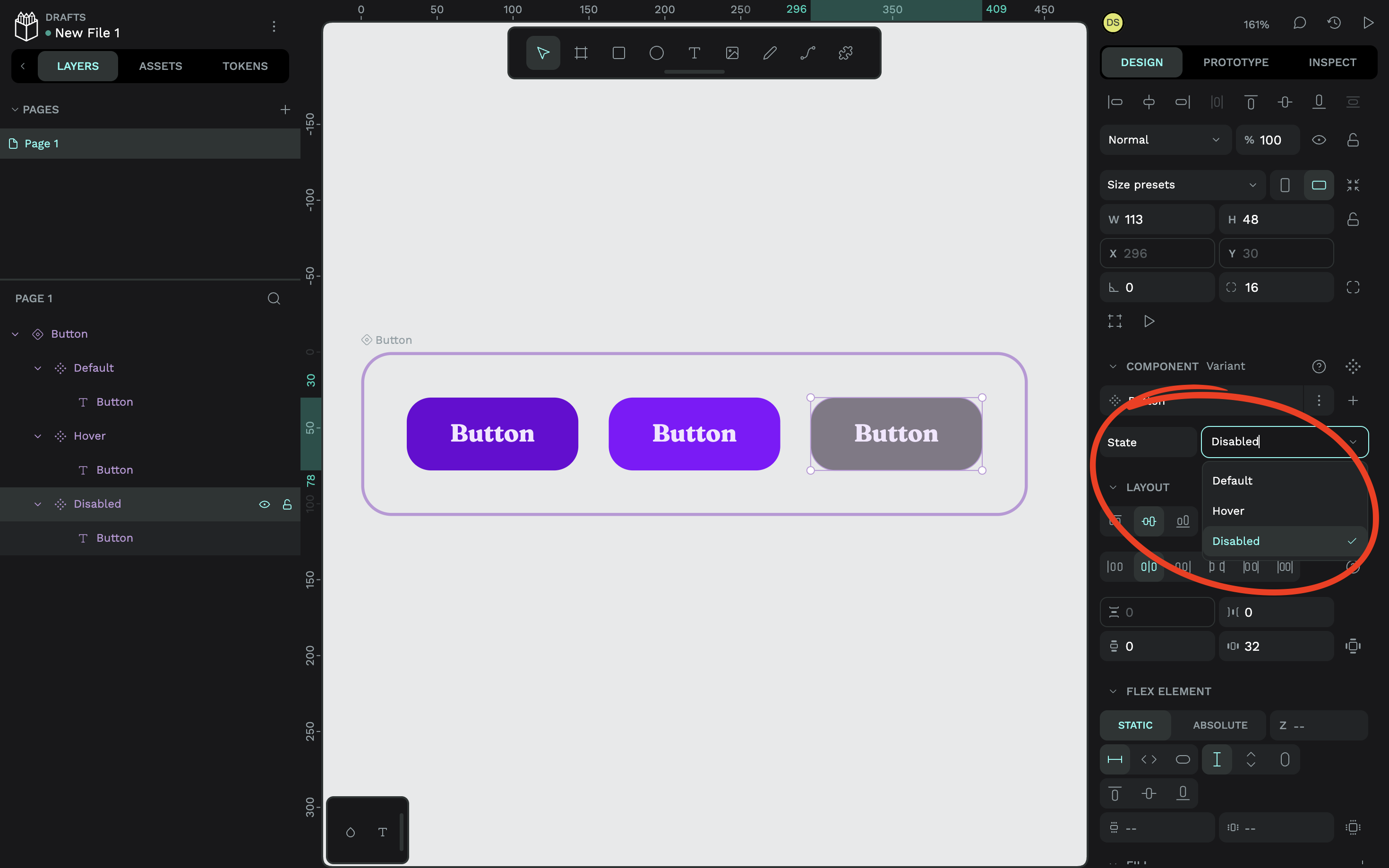
After that, as you might’ve guessed, you’ll want to name your variants. But avoid doing this via the “Layers” panel. Instead, select a variant and replace “Property 1” with a label that describes the differentiating property of each variant. Since my button variants in this example represent different states of the same button, I’ve named this “State”. This applies to all of the variants, so you only need to do this once.
Next to the property name, you’ll see “Value 1” or something similar. Edit that for each variant, for example, the name of the state. In my case, I’ve named them “Default”, “Hover”, and “Disabled”.
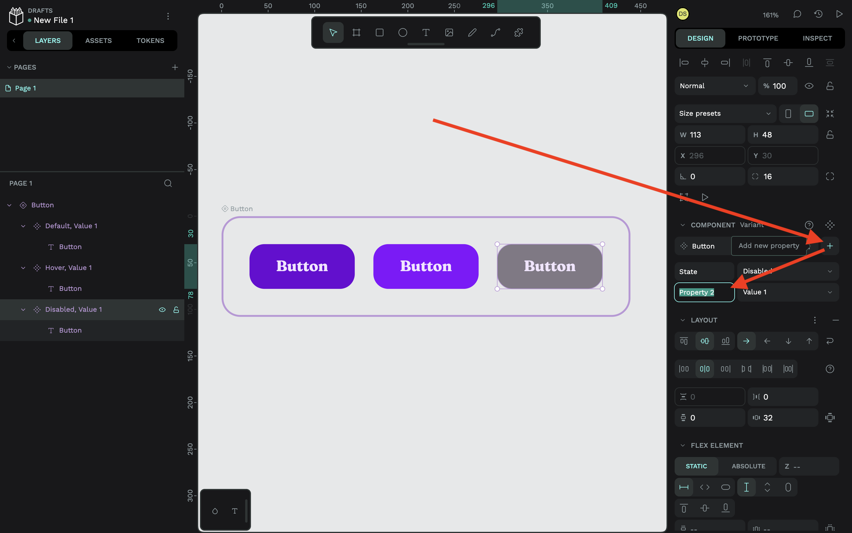
And yes, you can add more properties to a component. To do this, click on the nearby plus (+) icon. I’ll talk more about component variants at scale in a minute, though.
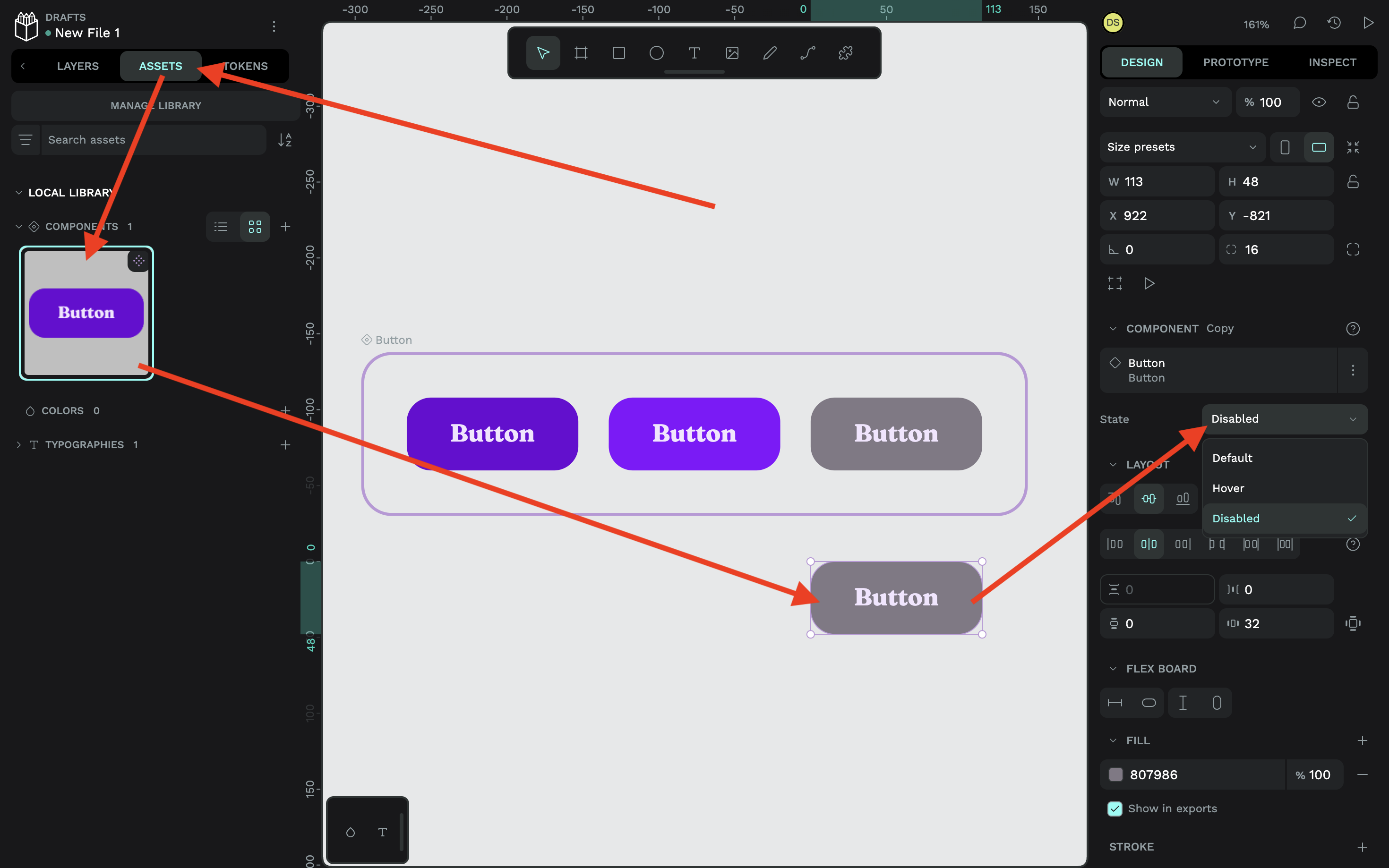
To see the component in action, switch to the “Assets” tab (located in the left panel) and drag the component onto the canvas to initialize one instance of it. Again, remember to choose the correct property value from the “Design” tab:
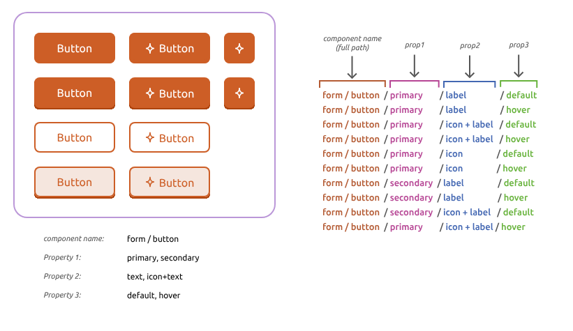
If you already have a Penpot design system, combining multiple components into one component with variants is not only easy and error-proof, but you might be good to go already if you’re using a robust property naming system that uses forward slashes (/). Penpot has put together a very straightforward guide, but the diagram below sums it up pretty well:
How Component Variants Work At Scale
Design tokens, components, and component variants — the triple-threat of design systems — work together, not just to create powerful yet flexible design systems, but sustainable design systems that scale. This is easier to accomplish when thinking ahead, starting with design tokens that separate the “what” from the “what for” using token aliases, despite how verbose that might seem at first.
For example, I used color.brand.lightest for the text color of every variant, but instead of plugging that color token in directly, I created aliases such as text.button.primary.default. This means that I can change the text color of any variant later without having to dive into the actual variant on the canvas, or force a change to color.brand.lightest that might impact a bunch of other components.
Because remember, while the component and its variants give us reusability of the button, the color tokens give us reusability of the colors, which might be used in dozens, if not hundreds, of other components. A design system is like a living, breathing ecosystem, where some parts of it are connected, some parts of it aren’t connected, and some parts of it are or aren’t connected but might have to be later, and we need to be ready for that.
The good news is that Penpot makes all of this pretty easy to manage as long as you do a little planning beforehand.
Consider the following:
- The design tokens that you’ll reuse (e.g., colors, font sizes, and so on),
- Where design token aliases will be reused (e.g., buttons, headings, and so on),
- Organizing the design tokens into sets,
- Organizing the sets into themes,
- Organizing the themes into groups,
- The different components that you’ll need, and
- The different variants and variant properties that you’ll need for each component.
Even the buttons that I designed here today can be scaled far beyond what I’ve already mocked up. Think of all the possible variants that might come up, such as a secondary button color, a tertiary color, a confirmation color, a warning color, a cancelled color, different colors for light and dark mode, not to mention more properties for more states, such as active and focus states. What if we want a whole matrix of variants, like where buttons in a disabled state can be hovered and where all buttons can be focused upon? Or where some buttons have icons instead of text labels, or both?
Designs can get very complicated, but once you’ve organized them into design tokens, components, and component variants in Penpot, they’ll actually feel quite simple, especially once you’re able to see them on the canvas, and even more so once you’ve made a significant change in just a few seconds without breaking anything.
Conclusion
This is how we make component variants work at scale. We get the benefits of reusability while keeping the flexibility to fork any aspect of our design system, big or small, without breaking out of it. And design tools like Penpot make it possible to not only establish a design system, but also express its design tokens and styles as code.
